Dark mode as an aesthetic
A single permanent art direction, not a switchable theme – elevation by lighter surfaces, text never pure white, accents desaturated.
Read the entryAlso called: Dark aesthetic
A single permanent art direction, not a switchable theme – elevation by lighter surfaces, text never pure white, accents desaturated.
Lineage: Dark mode went mainstream as a toggle when Apple and Google shipped system support in 2019; the aesthetic version never offers the light half.
Dark mode as an aesthetic
A single permanent art direction, not a switchable theme – elevation by lighter surfaces, text never pure white, accents desaturated.
Read the entryA working sample – the controls are live (hover, press, focus, the toggle's two states) and everything inside the frame is painted by the token block shown in the recipe below. Nothing saves anything; "Advanced options" jumps to the recipe. The page around the frame stays in Atlas's own system.
#121212#1e1e1e#2a2a2a#333333#e6e6e6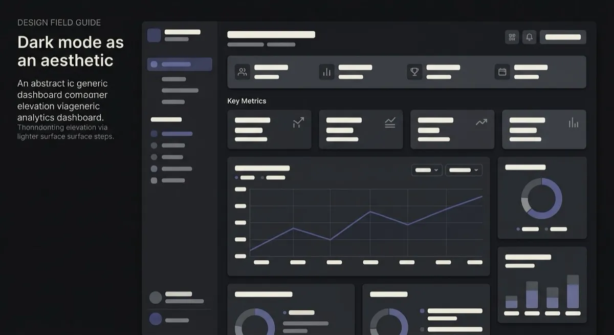
There’s a toggle in this site’s header; flip it and everything changes – except the card above, which stays dark either way. That’s the whole entry, demonstrated: quoted from the source directly, “A dark aesthetic is a single permanent art direction… Dark mode is a switchable theme of the same product (two token sets, one structure).” A product with genuine dark-as-aesthetic never offers a light alternative, because the darkness is doing brand and mood work, not preference work.
Two honesty notes on the stage. The card’s quiet borders are waived pairs in this site’s contrast gate – the recipe’s own rgba(255,255,255,0.12) hairlines composited to hex – because in this style elevation does the separating, which is exactly the tell being taught. And this is the entry most likely to correct an existing habit rather than add vocabulary: Linear reads as intentional not because “dark mode is enabled” but because of these specific moves – no light alternative, surface-lightness elevation, desaturated accents.
Dark mode became a platform expectation almost overnight when Apple and Google shipped system-wide support in 2019 – and nearly all discussion since has treated it as a setting. This entry names the different-in-kind case, because conflating the two is a common and correctable imprecision.
Developer and technical tools (matches the audience’s environment, easier on the eyes across long sessions), media and entertainment consumption (dark surrounds don’t compete with bright content), premium-technical brand positioning.
Reading-heavy, content-first products over long sessions – extended reading is measurably more comfortable at higher ambient brightness for most people, which is why reading products generally default light. And the sharpest warning: choosing it reflexively because it “looks premium” rather than because it serves the product’s use pattern – note 09 flags unconsidered default-dark as a named AI-slop tell. The strategic defaults: technical products default dark; reading products default light; both are decisions, not vibes.
Dark mode – the toggle this very site has. Two token sets, one structure, user’s choice. If a light alternative exists, you’re looking at a theme, not an aesthetic. Terminal – dark by inheritance from real hardware constraints, monospace-exclusive and deliberately exclusionary; the dark aesthetic is broader, softer and brand-motivated.
The actual scope from style-scopes.css – the CSS that painted the stage above.
/* ===== style: dark-aesthetic ===== */
/* A permanent art direction, not a toggle: elevation via lighter surface
   steps, text never pure white, desaturated accent, no shadows. */
[data-style='dark-aesthetic'] {
  --bg-page: #121212;
  --bg-raised: #1e1e1e;
  --bg-active: #2a2a2a;
  /* @contrast-waiver: border-default/bg-page – the recipe's
     rgba(255,255,255,0.12) composited over --bg-raised #1e1e1e gives
     #393939; pinned a step blue (#3a3a3d) to match the accent's
     temperature. Deliberately quiet: elevation does the separating.
     Taught in the entry's tells. */
  /* @contrast-waiver: border-default/bg-raised – as above; the surface
     ladder (#121212 -> #1e1e1e -> #2a2a2a) is the boundary system. */
  --border-default: #3a3a3d;
  --border-hover: #4d4d51;
  --border-input: #6e6e73;
  --text-primary: #e6e6e6;
  --text-secondary: #a8a8a8;
  --accent-solid: #8791d9;
  --accent-solid-hover: #99a2e2;
  --accent-text: #a9b1e8;
  --on-accent: #14161f;
  --radius-s: 8px;
  --radius-m: 10px;
  --radius-l: 12px;
  --shadow-1: none;
  --shadow-2: none;
  --font-sans: system-ui, -apple-system, 'Helvetica Neue', sans-serif;
}
.sty-card[data-style='dark-aesthetic']:hover {
  background: #232323;
}
/* Vignette: the surface ladder itself – #121212 to #333333, each step
   "closer to the user", no shadow anywhere. The tell, drawn literally. */
[data-style='dark-aesthetic'] .sty-art {
  border-color: #3a3a3d;
}
[data-style='dark-aesthetic'] .sty-art > i {
  border-radius: 8px;
  opacity: 1;
}
[data-style='dark-aesthetic'] .sty-art .sty-art-a {
  inset: 16px auto auto 16px;
  width: 72%;
  height: 78px;
  background: #1e1e1e;
}
[data-style='dark-aesthetic'] .sty-art .sty-art-b {
  inset: 30px auto auto 32px;
  width: 52%;
  height: 50px;
  background: #2a2a2a;
}
[data-style='dark-aesthetic'] .sty-art .sty-art-c {
  inset: 44px auto auto 48px;
  width: 32%;
  height: 22px;
  background: #333333;
}
/* ===== end dark-aesthetic ===== */Meant to be copied, not paraphrased – anchors beat adjectives when briefing an agent.
Named links out – the vignettes above are reconstructions, never screenshots (ADR #006).