Terminal / hacker aesthetic
Phosphor green on near-black, monospace without exception, zero decoration – an engineering constraint adopted as identity.
Read the entryAlso called: CLI aesthetic · Hacker green · Retro-terminal
Phosphor green on near-black, monospace without exception, zero decoration – an engineering constraint adopted as identity.
Lineage: Born of 1970s-80s CRT hardware – green phosphor was the cheapest, most flicker-resistant coating for sharp text – then kept on purpose.
Terminal / hacker aesthetic
Phosphor green on near-black, monospace without exception, zero decoration – an engineering constraint adopted as identity.
Read the entryA working sample – the controls are live (hover, press, focus, the toggle's two states) and everything inside the frame is painted by the token block shown in the recipe below. Nothing saves anything; "Advanced options" jumps to the recipe. The page around the frame stays in Atlas's own system.
#00ff41#071108#00c634#ffb000#e8e8e8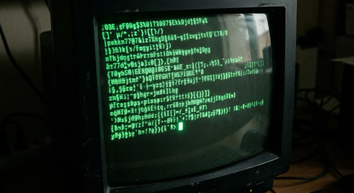
Green text, black screen, a cursor blinking at nobody: fifty years of engineering constraint worn as a badge. The terminal aesthetic is a rare case in this catalogue – a style whose entire visual signature originated as a hardware limitation (green phosphor was the cost-effective, flicker-resistant choice for 1970s-80s CRT monitors) and was adopted deliberately once the limitation vanished. Structurally the same move as skeuomorphism, but referencing a technical artefact rather than a physical material.
The card above keeps the discipline: VT323 (a CRT-period digitisation) as the only face, phosphor glow on the text, scanlines on the vignette, and a blinking cursor that respects prefers-reduced-motion – period authenticity, current manners.
The philosophy deserves stating as directly as the source does: “this product is built by engineers, for engineers. No softening. No decoration. No apology.” The style deliberately forgoes broad approachability in favour of in-group technical credibility – which is precisely why it works where it works and repels where it doesn’t. Warp is the instructive modern exemplar: it evolves the aesthetic (block-based command UI, IDE affordances) rather than cosplaying 1982.
Developer tools, security and infrastructure products, anything signalling deep technical credibility to a specifically technical audience – people for whom the green-on-black reads as home.
Essentially any consumer-facing or broad-audience product. The style’s value proposition is exclusionary signalling – “this is for people who already know terminals” – which is actively counterproductive outside that audience. There’s no softened version; softening it deletes it.
Dark mode as an aesthetic – also permanently dark, but brand-motivated, softer, and typographically free. Terminal is monospace-or-nothing with a hardware ancestry; if the type is proportional, whatever it is, it isn’t this.
The actual scope from style-scopes.css – the CSS that painted the stage above.
/* ===== style: terminal ===== */
/* An engineering constraint adopted as identity: phosphor green on
   near-black, monospace without exception, zero decoration. */
[data-style='terminal'] {
  --bg-page: #071108;
  --bg-raised: #0c180d;
  --bg-active: #122514;
  --border-default: #1f8f3a;
  --border-hover: #2fb551;
  --border-input: #1f8f3a;
  --text-primary: #00ff41;
  --text-secondary: #00c634;
  --accent-solid: #00ff41;
  --accent-solid-hover: #7dffa0;
  --accent-text: #00ff41;
  --on-accent: #001606;
  --radius-s: 0px;
  --radius-m: 0px;
  --radius-l: 0px;
  --shadow-1: none;
  --shadow-2: none;
  --font-sans: 'VT323', 'Geist Mono Variable', ui-monospace, monospace;
}
[data-style='terminal'] .sty-name,
[data-style='terminal'] .sty-body,
[data-style='terminal'] .sty-meta {
  text-shadow: 0 0 6px rgba(0, 255, 65, 0.45);
}
[data-style='terminal'] .sty-name {
  font-size: var(--text-2xl);
  font-weight: 400;
  text-transform: uppercase;
}
[data-style='terminal'] .sty-meta::after {
  content: '▮';
  margin-left: 6px;
  animation: sty-blink 1.1s steps(1) infinite;
}
@keyframes sty-blink {
  50% {
    opacity: 0;
  }
}
@media (prefers-reduced-motion: reduce) {
  [data-style='terminal'] .sty-meta::after {
    animation: none;
  }
}
.sty-card[data-style='terminal']:hover {
  box-shadow: none;
  background: #0e1c0f;
}
/* Vignette: prompt lines under scanlines. The art is aria-hidden; the
   command text is set dressing, not content. */
[data-style='terminal'] .sty-art {
  background: #050d06;
}
[data-style='terminal'] .sty-art::before {
  content: '> run styles --list';
  position: absolute;
  inset: 14px auto auto 14px;
  font-family: 'VT323', ui-monospace, monospace;
  font-size: 17px;
  color: #00ff41;
  text-shadow: 0 0 6px rgba(0, 255, 65, 0.45);
}
[data-style='terminal'] .sty-art::after {
  content: '';
  position: absolute;
  inset: 0;
  pointer-events: none;
  background: repeating-linear-gradient(0deg, rgba(0, 255, 65, 0.04) 0 1px, transparent 1px 3px);
}
[data-style='terminal'] .sty-art > i {
  background: #00c634;
  height: 8px;
  border-radius: 0;
  opacity: 0.8;
}
[data-style='terminal'] .sty-art .sty-art-a {
  inset: 44px auto auto 14px;
  width: 54%;
}
[data-style='terminal'] .sty-art .sty-art-b {
  inset: 62px auto auto 14px;
  width: 40%;
}
[data-style='terminal'] .sty-art .sty-art-c {
  inset: 80px auto auto 14px;
  width: 22%;
  height: 14px;
  background: #00ff41;
}
/* Hover: the phosphor flares. */
.sty-card[data-style='terminal']:hover .sty-name {
  text-shadow: 0 0 12px rgba(0, 255, 65, 0.85);
}
/* ===== end terminal ===== */Meant to be copied, not paraphrased – anchors beat adjectives when briefing an agent.
Named links out – the vignettes above are reconstructions, never screenshots (ADR #006).