Editorial / magazine
The reading is the product – high-contrast serif display, disciplined columns, pull quotes as rhythm, imagery as pacing.
Read the entryAlso called: Print-inspired web design · Magazine-style layout
The reading is the product – high-contrast serif display, disciplined columns, pull quotes as rhythm, imagery as pacing.
Lineage: A direct transplant of print magazine conventions – columns, pull quotes, drop caps, bylines – onto the web.
Editorial / magazine
The reading is the product – high-contrast serif display, disciplined columns, pull quotes as rhythm, imagery as pacing.
Read the entryA working sample – the controls are live (hover, press, focus, the toggle's two states) and everything inside the frame is painted by the token block shown in the recipe below. Nothing saves anything; "Advanced options" jumps to the recipe. The page around the frame stays in Atlas's own system.
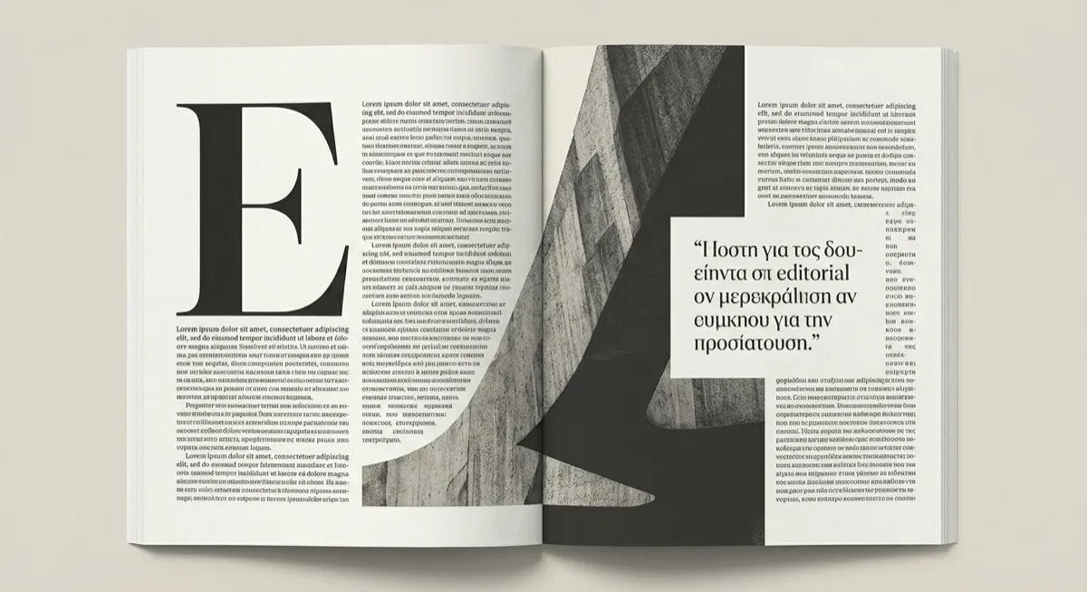
Open a well-made magazine and notice what your eye does: settles into a column, pauses at a pull quote, resets at a drop cap. Editorial design brings that paced reading journey to the web – the card above wears its serif display face (Fraunces, standing in for the commercial Denton/Tiempos/Lyon tier the note names) and the paper-neutral palette that lets type carry everything.
A direct transplant of print publication conventions onto the web, aiming to recreate the reading experience rather than a task-oriented app layout. The 2026-specific development is typographic: a swing towards maximalist, high-contrast serifs for hero headings – exaggerated stroke contrast as the display voice – rather than the restrained low-contrast serifs of a decade prior.
Content-first products where the reading is the product: long-form journalism, blogs, case studies, documentation that wants to feel considered rather than merely functional. The discipline transfers directly from print practice – measure and leading are inherited numbers, not aesthetic guesses.
Task-oriented product UI. A user completing an action isn’t settling in for a considered read, and the deliberate pacing this style optimises for – rhythm breaks, visual beats – is directly at odds with task efficiency.
Swiss style – both are grid-disciplined and typography-led, but they optimise for different things. Swiss optimises for objective legibility and content-neutrality; editorial optimises for a paced journey with deliberate rhythm. The test case is the pull quote: editorial treats it as structural, Swiss would call it decorative noise. Same discipline, opposite philosophy about drama.
The actual scope from style-scopes.css – the CSS that painted the stage above.
/* ===== style: editorial ===== */
/* The reading is the product: high-contrast serif display, baseline
   discipline, pull-quote rhythm, a neutral paper palette. */
[data-style='editorial'] {
  --bg-page: #faf7f1;
  --bg-raised: #fffdf8;
  --bg-active: #f0ebe0;
  --border-default: #6f6a5f;
  --border-hover: #55514a;
  --border-input: #6f6a5f;
  --text-primary: #1b1916;
  --text-secondary: #4f4a42;
  --accent-solid: #8c2318;
  --accent-solid-hover: #6e1b12;
  --accent-text: #8c2318;
  --on-accent: #fdf9f0;
  --radius-s: 0px;
  --radius-m: 2px;
  --radius-l: 2px;
  --shadow-1: none;
  --shadow-2: none;
  --font-sans: Georgia, 'Iowan Old Style', 'Times New Roman', serif;
}
[data-style='editorial'] .sty-name {
  font-family: 'Fraunces Variable', Georgia, serif;
  font-weight: 800;
  font-size: var(--text-2xl);
  letter-spacing: -0.01em;
}
.sty-card[data-style='editorial'] {
  border-width: 0;
  border-top: 3px solid var(--text-primary);
}
/* Vignette: a drop cap, column rules and text-greek bars – the page as
   a page. */
[data-style='editorial'] .sty-art {
  border: none;
  background:
    linear-gradient(#6f6a5f, #6f6a5f) no-repeat 46% 14px / 1px calc(100% - 28px),
    linear-gradient(#6f6a5f, #6f6a5f) no-repeat 74% 14px / 1px calc(100% - 28px),
    #fffdf8;
}
[data-style='editorial'] .sty-art::before {
  content: 'A';
  position: absolute;
  inset: 10px auto auto 14px;
  font-family: 'Fraunces Variable', Georgia, serif;
  font-weight: 900;
  font-size: 56px;
  line-height: 1;
  color: #1b1916;
}
[data-style='editorial'] .sty-art > i {
  background: #4f4a42;
  height: 4px;
  border-radius: 0;
  opacity: 0.75;
}
[data-style='editorial'] .sty-art .sty-art-a {
  inset: 22px auto auto 58px;
  width: 28%;
}
[data-style='editorial'] .sty-art .sty-art-b {
  inset: 34px auto auto 58px;
  width: 24%;
}
[data-style='editorial'] .sty-art .sty-art-c {
  inset: auto auto 16px 58px;
  width: 30%;
  height: 4px;
  background: #8c2318;
}
/* Hover: the masthead rule thickens; padding compensates so type holds still. */
.sty-card[data-style='editorial']:hover {
  border-top-width: 6px;
  padding-top: calc(var(--space-5) - 3px);
  box-shadow: none;
}
/* ===== end editorial ===== */Meant to be copied, not paraphrased – anchors beat adjectives when briefing an agent.
Named links out – the vignettes above are reconstructions, never screenshots (ADR #006).