Swiss style
The mathematical grid, asymmetric layout and Helvetica that digital minimalism descends from – content recognised and understood by anyone, personality second.
Read the entryAlso called: International Typographic Style · Swiss Design
The mathematical grid, asymmetric layout and Helvetica that digital minimalism descends from – content recognised and understood by anyone, personality second.
Lineage: Basel and Zürich design schools, late 1940s; classic period through the 1950s-60s under Müller-Brockmann, Hofmann and Ruder.
Swiss style
The mathematical grid, asymmetric layout and Helvetica that digital minimalism descends from – content recognised and understood by anyone, personality second.
Read the entryA working sample – the controls are live (hover, press, focus, the toggle's two states) and everything inside the frame is painted by the token block shown in the recipe below. Nothing saves anything; "Advanced options" jumps to the recipe. The page around the frame stays in Atlas's own system.
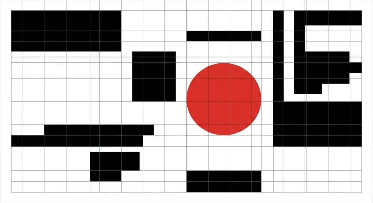
#ffffff#111111#d40920Imagine a design philosophy whose whole point is that you shouldn’t notice the design – the content should be “easily recognised and understood by anyone”, and every choice serves that legibility. That’s Swiss style, formally the International Typographic Style, and it’s the reason the stage above uses the real Helvetica sitting on your device rather than a webfont imitation: the movement’s signature typeface, doing its actual job.
It emerged from the Basel and Zürich design schools in the late 1940s – Ernst Keller had been forming the founding principles at Zürich’s School of Applied Arts since 1918 – and hit its classic period through the 1950s and 60s under Josef Müller-Brockmann, Armin Hofmann and Emil Ruder. Müller-Brockmann’s The Grid System in Graphic Design is the canonical text: the mathematical modular grid it formalised is the single idea every later “grid-based” lineage traces back to, which makes Swiss style genuinely minimalism’s ancestor, not a parallel movement. It reacted against ornamental graphic design in favour of objectivity, and Helvetica (1957, Max Miedinger with Eduard Hoffmann) was designed to serve exactly that – a “pure”, maximally readable face for long text. (Medium confidence on the specific dates and names – corroborated across multiple design-history sources, not yet checked against a primary academic text.)
Wayfinding, information-dense content that must scan at speed, and any brand wanting to signal precision, objectivity or institutional trust. When the content genuinely is the product – timetables, signage, documentation – this is the system that disappears in its favour.
Anything that needs warmth or playfulness as its primary signal. The whole philosophy is that the content speaks, not the design – the opposite instinct to a brand trying to feel approachable or fun.
Minimalism – the descendant. Minimalism inherited the restraint but relaxed the formal system; Swiss style is the system. If the grid is genuinely modular and body copy is flush-left ragged-right without exception, you’re looking at the ancestor. And note the briefing trick from the source note: naming the “Müller-Brockmann grid” anchors an agent far harder than “clean grid design” ever will.
Editorial – both are grid-disciplined and typography-led, but they optimise for different things. Swiss style optimises for objective legibility; editorial design paces a reading journey with pull quotes and imagery as rhythm. Swiss style would file a pull quote under decorative noise.
The actual scope from style-scopes.css – the CSS that painted the stage above.
/* ===== style: swiss ===== */
/* Objective and legible over expressive: mathematical grid, asymmetry,
   Helvetica (the real face on Apple hardware), poster red, no ornament. */
[data-style='swiss'] {
  --bg-page: #ffffff;
  --bg-raised: #ffffff;
  --bg-active: #f2f2f2;
  --border-default: #111111;
  --border-hover: #111111;
  --border-input: #111111;
  --text-primary: #111111;
  --text-secondary: #333333;
  --accent-solid: #d40920;
  --accent-solid-hover: #a90719;
  --accent-text: #c00518;
  --on-accent: #ffffff;
  --radius-s: 0px;
  --radius-m: 0px;
  --radius-l: 0px;
  --shadow-1: none;
  --shadow-2: none;
  --font-sans: 'Helvetica Neue', Helvetica, Arial, sans-serif;
}
[data-style='swiss'] .sty-name {
  font-weight: 700;
  letter-spacing: -0.02em;
}
[data-style='swiss'] .sty-btn {
  border-radius: 0;
}
/* Poster vignette: modular grid lines, asymmetric black bars, one red
   circle bottom-right – the Müller-Brockmann move, drawn not pictured. */
[data-style='swiss'] .sty-art {
  border: none;
  background:
    linear-gradient(#111111, #111111) no-repeat 62% 0 / 1px 100%,
    linear-gradient(#111111, #111111) no-repeat 0 66% / 100% 1px,
    #ffffff;
}
[data-style='swiss'] .sty-art .sty-art-a {
  inset: 14px auto auto 12px;
  width: 46%;
  height: 18px;
  background: #111111;
  border-radius: 0;
}
[data-style='swiss'] .sty-art .sty-art-b {
  inset: 40px auto auto 12px;
  width: 28%;
  height: 8px;
  background: #111111;
  border-radius: 0;
  opacity: 1;
}
[data-style='swiss'] .sty-art .sty-art-c {
  inset: auto 14px 12px auto;
  left: auto;
  width: 44px;
  height: 44px;
  background: #d40920;
  border-radius: 999px;
}
/* Hover: the accent does its single job – the functional red, nothing else. */
.sty-card[data-style='swiss']:hover {
  border-color: #d40920;
  box-shadow: none;
}
/* ===== end swiss ===== */Meant to be copied, not paraphrased – anchors beat adjectives when briefing an agent.
Named links out – the vignettes above are reconstructions, never screenshots (ADR #006).