Maximalism
Layered texture, exaggerated hierarchy and ornament as a feature – the live counter-movement to minimalism, now pivoting tactile.
Read the entryAlso called: Tactile maximalism · More is more
Layered texture, exaggerated hierarchy and ornament as a feature – the live counter-movement to minimalism, now pivoting tactile.
Lineage: Minimalism's standing counter-movement; the 2026 pivot is from flat decorative excess towards rich sensory texture.
Maximalism
Layered texture, exaggerated hierarchy and ornament as a feature – the live counter-movement to minimalism, now pivoting tactile.
Read the entryA working sample – the controls are live (hover, press, focus, the toggle's two states) and everything inside the frame is painted by the token block shown in the recipe below. Nothing saves anything; "Advanced options" jumps to the recipe. The page around the frame stays in Atlas's own system.
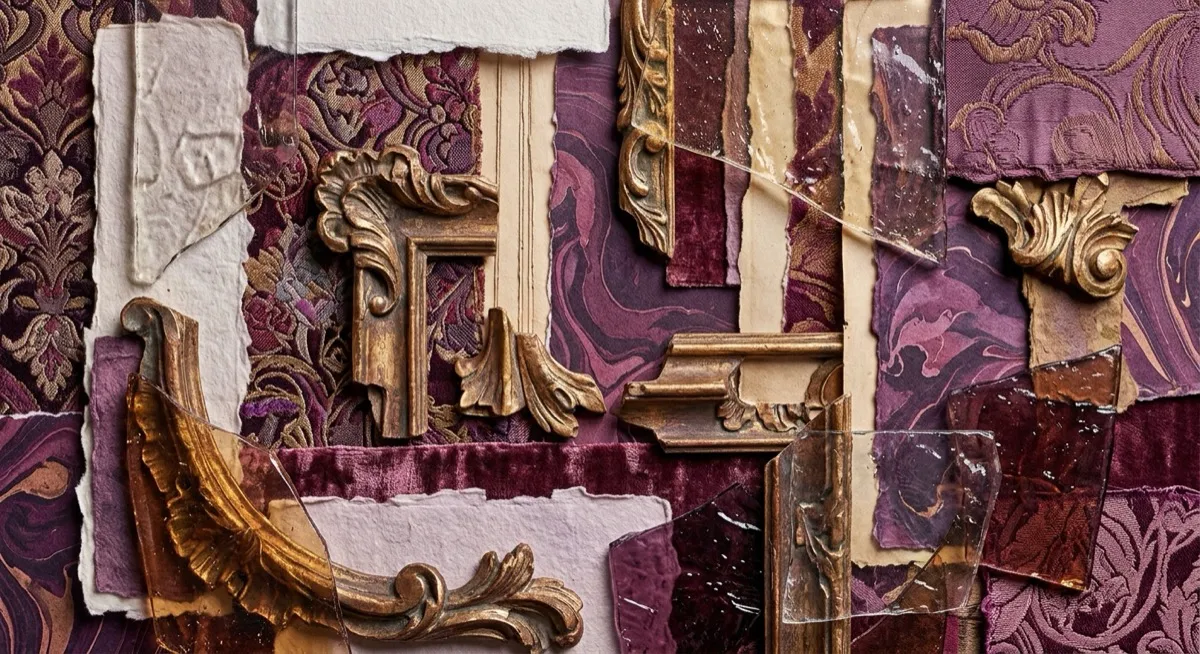
Where minimalism whispers one thing, maximalism sings several at once – and the current version wants you to feel it: 2026 sources describe “a massive pendulum swing toward Tactile Maximalism… a strategy employing rich, sensory textures like glass, paper, and grain to mimic the physical world and counter digital sterility”. That pivot matters technically: current maximalism increasingly overlaps with skeuomorphic and claymorphic texture techniques, rather than being purely about colour and pattern density the way the early-2020s version was.
The card above demonstrates the exaggerated-hierarchy subtrend directly – an oversized sculptural serif name against deliberately small uppercase metadata – plus the layered glow-and-grain drama.
Note 09 carries the full minimalism-versus-maximalism debate, including its most useful synthesis: hybrid wins – maximalism for first impressions, minimalism for lasting daily-use interactions. This entry adds the concrete visual specifics; the argument about when each register earns its keep lives there.
Brand-forward marketing and campaign surfaces, especially in categories where every competitor already looks minimalist-and-safe – the stand-out value is highest exactly where restraint is the unmarked default. Consumer and entertainment brands wanting energy over calm.
Daily-use product UI, per the hybrid synthesis. Density and visual competition for attention are directly counterproductive once someone performs the same task repeatedly – the hundredth session punishes what the first session enjoyed.
Anti-design – both are loud, but maximalism still wants to be liked: it layers richness towards delight. Anti-design deliberately courts discomfort as a differentiation strategy. And where maximalism harmonises many elements, anti-design tunes them to almost-clash on purpose.
The actual scope from style-scopes.css – the CSS that painted the stage above.
/* ===== style: maximalism ===== */
/* Tactile more-is-more: layered texture and glow, exaggerated hierarchy,
   ornament as a feature. Jewel ground, gold action. */
[data-style='maximalism'] {
  --bg-page: #2a1136;
  --bg-raised: #3d1b4f;
  --bg-active: #4e2663;
  --border-default: #a678c8;
  --border-hover: #c39ade;
  --border-input: #a678c8;
  --text-primary: #ffeedd;
  --text-secondary: #e9c7ea;
  --accent-solid: #ffb703;
  --accent-solid-hover: #ffd23f;
  --accent-text: #ffcf70;
  --on-accent: #2a1105;
  --radius-s: 4px;
  --radius-m: 12px;
  --radius-l: 20px;
  --shadow-1: 0 6px 0 #b23f8f, 0 14px 30px rgba(178, 63, 143, 0.45);
  --shadow-2: 0 8px 0 #b23f8f, 0 20px 40px rgba(178, 63, 143, 0.55);
  --font-sans: system-ui, -apple-system, 'Helvetica Neue', sans-serif;
}
[data-style='maximalism'] .sty-name {
  font-family: 'Fraunces Variable', Georgia, serif;
  font-weight: 900;
  font-size: var(--text-2xl);
}
[data-style='maximalism'] .sty-meta {
  font-size: 0.6875rem;
  text-transform: uppercase;
  letter-spacing: 0.12em;
}
/* Vignette: layered pattern over pattern, gold ring, grain on top –
   texture as the point (the 2026 tactile pivot). */
[data-style='maximalism'] .sty-art {
  border: none;
  background:
    repeating-linear-gradient(135deg, rgba(255, 183, 3, 0.16) 0 10px, transparent 10px 26px),
    radial-gradient(circle at 22% 30%, rgba(224, 82, 153, 0.55) 0 34px, transparent 35px),
    radial-gradient(circle at 80% 72%, rgba(122, 90, 248, 0.5) 0 44px, transparent 45px),
    linear-gradient(160deg, #3d1b4f 0%, #24102f 100%);
}
[data-style='maximalism'] .sty-art::after {
  content: '';
  position: absolute;
  inset: 0;
  pointer-events: none;
  opacity: 0.07;
  background-image: url("data:image/svg+xml,%3Csvg xmlns='http://www.w3.org/2000/svg' width='120' height='120'%3E%3Cfilter id='g'%3E%3CfeTurbulence type='fractalNoise' baseFrequency='0.9' numOctaves='2'/%3E%3C/filter%3E%3Crect width='120' height='120' filter='url(%23g)'/%3E%3C/svg%3E");
}
[data-style='maximalism'] .sty-art > i {
  opacity: 1;
}
[data-style='maximalism'] .sty-art .sty-art-a {
  inset: 20px auto auto 24px;
  width: 46px;
  height: 46px;
  background: transparent;
  border: 7px solid #ffb703;
  border-radius: 999px;
  box-shadow: 0 4px 0 #b23f8f;
}
[data-style='maximalism'] .sty-art .sty-art-b {
  inset: 30px auto auto 96px;
  width: 42%;
  height: 12px;
  background: #ffcf70;
  border-radius: 2px;
  transform: rotate(-3deg);
}
[data-style='maximalism'] .sty-art .sty-art-c {
  inset: auto auto 14px 24px;
  width: 54%;
  height: 18px;
  background: linear-gradient(90deg, #e05299 0%, #7a5af8 100%);
  border-radius: 999px;
}
/* Hover: more, obviously – the layers saturate and push. */
.sty-card[data-style='maximalism']:hover .sty-art {
  filter: saturate(1.25) contrast(1.05);
}
/* ===== end maximalism ===== */Meant to be copied, not paraphrased – anchors beat adjectives when briefing an agent.
Named links out – the vignettes above are reconstructions, never screenshots (ADR #006).