Anti-design
Deliberately hard to average – off-balance layout, near-clashing colour, type in open tension. Intention, not randomness.
Read the entryAlso called: Antidesign
Deliberately hard to average – off-balance layout, near-clashing colour, type in open tension. Intention, not randomness.
Lineage: A 2025-26-emergent reaction to AI-generated design sameness; NN/g treats "antidesign" as its own category, distinct from brutalism.
Anti-design
Deliberately hard to average – off-balance layout, near-clashing colour, type in open tension. Intention, not randomness.
Read the entryA working sample – the controls are live (hover, press, focus, the toggle's two states) and everything inside the frame is painted by the token block shown in the recipe below. Nothing saves anything; "Advanced options" jumps to the recipe. The page around the frame stays in Atlas's own system.
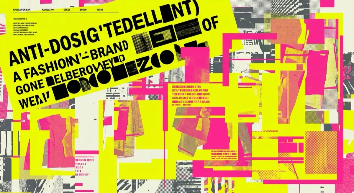
#e8fb3a#ff8ce1#2222ff#58f28d#101010If an AI model is trained to converge on safe, averaged-out defaults, one countermove is to become structurally impossible to average: friction, asymmetry and visual discomfort as the differentiation strategy itself. That’s anti-design, the most recent and most genuinely emergent entry in this catalogue – and the card above is this site’s most careful tightrope walk: acid yellow against hot pink, a shadow thrown the wrong way, a rotated poster-face name over serif body text. Almost clashing. Almost.
Originally this catalogue’s most speculative entry, resting on 2026 trend blogs – then independently strengthened on verification: Nielsen Norman Group published a dedicated article treating antidesign as a separate category, in their own words: “Though some lump this trend in with brutalism, it doesn’t fit with the original architectural sense of the word.” NN/g defines it as designers “intentionally creating ugly, disorienting, or complex interfaces” – field-establishment recognition, though still a genuinely new movement even by their framing.
NN/g gives the sharpest version of the rule – exactly two contexts: an audience of designers and artists, or entertainment products. High fashion’s web presences are the canonical exemplars precisely because those brands can afford friction as a message: “we are not trying to be liked by everyone.”
NN/g again, verbatim in spirit: outside those two contexts, “an antidesign UI will backfire.” Every source is explicit that the style must be used with real intention – push too far towards ugly-for-ugly’s-sake and it simply reads as broken. This is arguably the highest-risk entry in the catalogue to reach for without a clear brief, because it has no settled safe minimum. And a calibration note for this site’s own learner: almost never the right style for a first attempt while visual judgement is still being built – its entire effect depends on knowing exactly how far to push.
Web brutalism – narrower and more principled: brutalism’s core is “truth to materials” (show the raw HTML honestly); anti-design rejects harmony, balance and readability across the board as a maximal statement. Maximalism – also loud, but maximalism layers richness towards delight and still wants to be liked. One practical brief-writing note from the source: this is the entry where prompt vocabulary alone is least likely to land without a strong reference image alongside it (note 12’s screenshot-as-spec technique) – intentional-feeling wrongness is exactly what an unanchored text prompt struggles to hit.
The actual scope from style-scopes.css – the CSS that painted the stage above.
/* ===== style: anti-design ===== */
/* Deliberately hard to average: near-clashing colour, wrong-direction
   shadows, type in open tension – intention, not randomness. */
[data-style='anti-design'] {
  --bg-page: #e8fb3a;
  --bg-raised: #ff8ce1;
  --bg-active: #58f28d;
  --border-default: #101010;
  --border-hover: #101010;
  --border-input: #101010;
  --text-primary: #101010;
  --text-secondary: #2c2c2c;
  --accent-solid: #2222ff;
  --accent-solid-hover: #7300b3;
  --accent-text: #1414c8;
  --on-accent: #e8fb3a;
  --radius-s: 24px;
  --radius-m: 0px;
  --radius-l: 60px;
  --shadow-1: -6px 8px 0 #2222ff;
  --shadow-2: -9px 12px 0 #7300b3;
  --font-sans: 'Times New Roman', Times, serif;
}
.sty-card[data-style='anti-design'] {
  border-width: 2px;
  border-radius: var(--radius-l) var(--radius-m) var(--radius-s) var(--radius-m);
}
[data-style='anti-design'] .sty-name {
  font-family: 'Archivo Black', system-ui, sans-serif;
  font-weight: 400;
  font-size: var(--text-2xl);
  text-transform: uppercase;
  transform: rotate(-2deg);
  width: fit-content;
}
[data-style='anti-design'] .sty-meta {
  font-family: ui-monospace, monospace;
  transform: rotate(1deg);
  width: fit-content;
}
[data-style='anti-design'] .sty-btn {
  border: 2px solid #101010;
  border-radius: 0;
  transform: rotate(1.5deg);
}
/* Vignette: overlap, rotation, a shape escaping the frame, colours at
   the edge of clashing – off-balance with intent. */
[data-style='anti-design'] .sty-art {
  border-width: 2px;
  background: #58f28d;
}
[data-style='anti-design'] .sty-art > i {
  opacity: 1;
  border: 2px solid #101010;
}
[data-style='anti-design'] .sty-art .sty-art-a {
  inset: -12px auto auto 22px;
  width: 46%;
  height: 58px;
  background: #ff8ce1;
  border-radius: 0;
  transform: rotate(-7deg);
}
[data-style='anti-design'] .sty-art .sty-art-b {
  inset: 34px auto auto 118px;
  width: 54px;
  height: 54px;
  background: #2222ff;
  border-radius: 999px 0 999px 999px;
}
[data-style='anti-design'] .sty-art .sty-art-c {
  inset: auto auto -10px 52px;
  width: 40%;
  height: 40px;
  background: #e8fb3a;
  border-radius: 0 60px 0 0;
  transform: rotate(3deg);
}
/* Hover: further off-balance – the shadow flips to the other wrong direction. */
.sty-card[data-style='anti-design']:hover {
  transform: rotate(0.8deg);
  box-shadow: 6px -8px 0 #7300b3;
}
/* ===== end anti-design ===== */Meant to be copied, not paraphrased – anchors beat adjectives when briefing an agent.
Named links out – the vignettes above are reconstructions, never screenshots (ADR #006).