Minimalism
Hierarchy built from type size and whitespace alone – a five-colour budget where exactly one element speaks at full volume per screen.
Read the entryAlso called: Flat design · Flat UI · "Clean" design
Hierarchy built from type size and whitespace alone – a five-colour budget where exactly one element speaks at full volume per screen.
Lineage: Dieter Rams to Jony Ive to iOS 7 (2013), then a decade of near-total dominance.
Minimalism
Hierarchy built from type size and whitespace alone – a five-colour budget where exactly one element speaks at full volume per screen.
Read the entryA working sample – the controls are live (hover, press, focus, the toggle's two states) and everything inside the frame is painted by the token block shown in the recipe below. Nothing saves anything; "Advanced options" jumps to the recipe. The page around the frame stays in Atlas's own system.
#f7f5f1#fffefb#1f1d1a#565249#2a52c4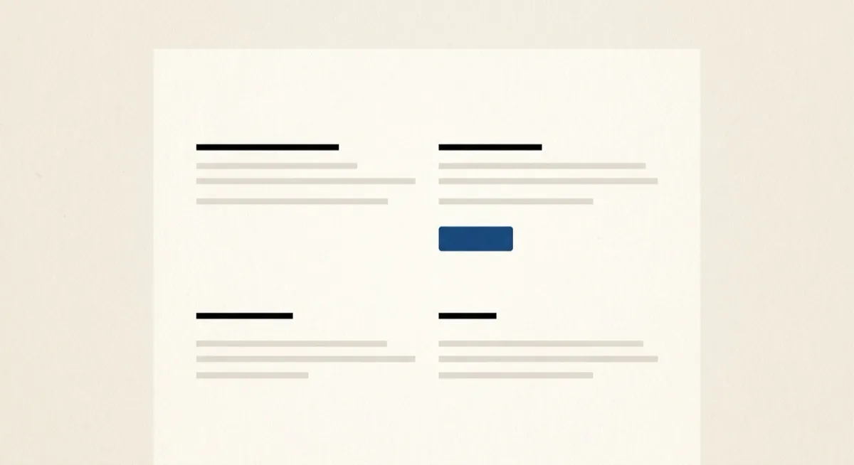
Strip a screen back until only the necessary survives, then let size and space do all the talking – that’s the whole move. The card above holds the recipe honestly: no shadow anywhere, one blue action, and everything else earning its place through scale. The term of art is minimalism, and its everyday alias “flat design” names the same instinct applied to surfaces – no bevels, no textures, no pretend depth.
The lineage runs from Dieter Rams’s “less, but better” industrial design through Jony Ive to iOS 7 in 2013, the moment flat design went from a choice to the default for a decade. The important recent turn (note 09 tells this story in full): once every product looked minimalist, minimalism stopped reading as clean and started reading as generic. The style didn’t die – it redefined itself around restraint (deliberate choice, visible care) rather than absence (empty space because nothing was decided). The five-colour budget above is what deliberate looks like; unlimited greys is what undecided looks like.
Any product where daily-use fatigue matters more than first-impression drama – dashboards, tools, anything used repeatedly rather than encountered once. Restraint compounds: the hundredth session rewards the quiet screen that the first session found unremarkable.
A first-touch marketing surface in a category where every competitor is already minimalist. Restraint stops reading as intentional once it’s the unmarked default – you’re not signalling taste, you’re disappearing. That’s the “minimalism became interchangeable” finding, and it’s why the prompt vocabulary names the palette budget explicitly: “minimal” alone drifts back towards slop-adjacent defaults, “five colours total” does not.
Swiss style – its direct ancestor, not a synonym. Swiss style is a formal system (mathematical grid, asymmetric layout, Helvetica, objectivity as philosophy); minimalism is the broader digital instinct that system fed into. If the layout obeys a visible modular grid and the type is flush-left ragged-right without exception, you’re looking at the ancestor.
The actual scope from style-scopes.css – the CSS that painted the stage above.
/* ===== style: minimalism ===== */
/* Five-colour budget: two neutrals, ink, muted ink, one accent reserved
   for the action. Hierarchy from type and whitespace – no shadows. */
[data-style='minimalism'] {
  --bg-page: #f7f5f1;
  --bg-raised: #fffefb;
  --bg-active: #efece6;
  --border-default: #827e76;
  --border-hover: #5f5c55;
  --border-input: #827e76;
  --text-primary: #1f1d1a;
  --text-secondary: #565249;
  --accent-solid: #2a52c4;
  --accent-solid-hover: #1f3f9d;
  --accent-text: #2a52c4;
  --on-accent: #ffffff;
  --radius-s: 6px;
  --radius-m: 10px;
  --radius-l: 14px;
  --shadow-1: none;
  --shadow-2: none;
  --font-sans: system-ui, -apple-system, 'Helvetica Neue', Arial, sans-serif;
}
[data-style='minimalism'] .sty-name {
  letter-spacing: var(--tracking-tight);
}
[data-style='minimalism'] .sty-art {
  border: none;
}
/* Hover: one quiet surface step – restraint is the hover state. */
.sty-card[data-style='minimalism']:hover {
  background: #fdfbf7;
  box-shadow: none;
}
/* ===== end minimalism ===== */Meant to be copied, not paraphrased – anchors beat adjectives when briefing an agent.
Named links out – the vignettes above are reconstructions, never screenshots (ADR #006).