Neubrutalism
If there is a 4px 4px 0
Read the entryAlso called: Neo-brutalism
If there is a 4px 4px 0
Lineage: Grew from Pascal Deville's 2014 brutalist curation; named and popularised by Michał Malewicz's March 2022 essay.
Neubrutalism
If there is a 4px 4px 0
Read the entryA working sample – the controls are live (hover, press, focus, the toggle's two states) and everything inside the frame is painted by the token block shown in the recipe below. Nothing saves anything; "Advanced options" jumps to the recipe. The page around the frame stays in Atlas's own system.
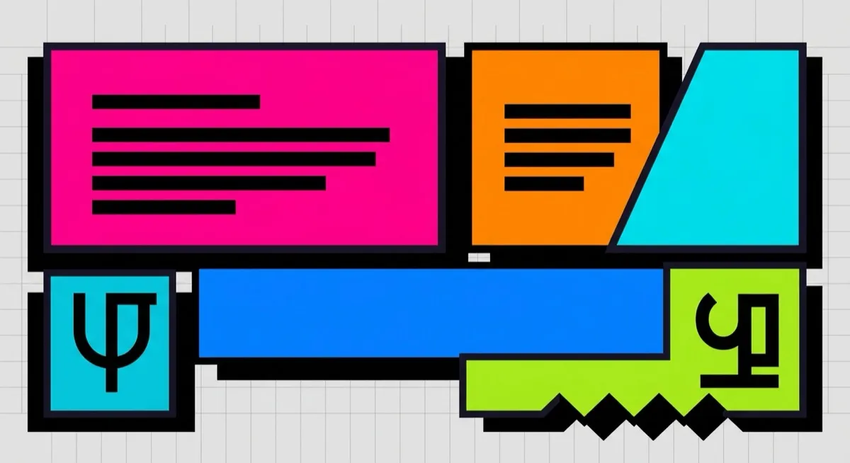
#ff5d00#ffc900#45c4ff#fdf0d5#000000Looks “wrong” on purpose – thick outlines, clashing candy colour, shadows like paper cut-outs – and the wrongness is the message: this brand is not trying to blend in with every polished SaaS product. That’s neubrutalism, and it has the single most checkable signature in this catalogue: the hard black offset shadow the card above wears – and on the catalogue index, hovering its card makes that shadow grow. No blur, ever. (The stage card here is pinned, per its caption.) Specifying that exact shadow value is the highest-leverage phrase in the entire catalogue when briefing an agent – it’s the one detail that separates a correct neubrutalist render from generic “bold and colourful”.
One honesty note: the orange button against the cream ground is a waived pair in this site’s contrast gate – candy-on-cream is the palette tell, and the component boundary is carried by the 2px black border, which passes at maximum contrast.
Two dated moments: Pascal Deville’s Brutalist Websites curation project (2014) seeded the raw-web sensibility, and Michał Malewicz’s March 2022 essay “Neubrutalism is taking over the web” named and popularised the current derivative. Nielsen Norman Group’s own assessment characterises it as “a reaction against sleek, minimalistic designs” and warns that “without balance, it can overwhelm users and hinder accessibility” – keep clear buttons, readable type and real whitespace discipline underneath the bold surface.
Brands that want confrontational playfulness as a signal – indie products, creative tools, anything positioning against corporate polish. The style works when the roughness is a surface choice layered over sound usability.
Whenever the roughness becomes licence to abandon usability – that’s NN/g’s whole caution. If buttons stop looking like buttons or type stops being readable, you’ve left neubrutalism and arrived at just-broken.
Web brutalism – the distinction is load-bearing and technically precise: web brutalism has zero box-shadow anywhere; neubrutalism is defined by its hard offset shadow. Add candy colour and playful shapes to the contrast list. They read similar at a glance (bold, raw, unpolished) and are opposite on the one property that defines them – briefing an agent with the wrong one produces a genuinely different result, not a slightly different one. Whenever “brutalist” comes up, the reflexive next question is: which of the two?
The actual scope from style-scopes.css – the CSS that painted the stage above.
/* ===== style: neubrutalism ===== */
/* If there is a 4px 4px 0 #000 shadow, it is neubrutalism: hard offset,
   no blur, thick black borders, candy-bright fills, bold type. */
[data-style='neubrutalism'] {
  --bg-page: #fdf0d5;
  --bg-raised: #ffffff;
  --bg-active: #ffe8a3;
  --border-default: #000000;
  --border-hover: #000000;
  --border-input: #000000;
  --text-primary: #000000;
  --text-secondary: #1a1a1a;
  /* @contrast-waiver: accent-solid/bg-page – candy fill against cream is
     the palette tell; the component boundary is the 2px black border
     (SC 1.4.11 boundary via border), which passes at maximum contrast. */
  --accent-solid: #ff5d00;
  --accent-solid-hover: #ffc900;
  --accent-text: #b3261e;
  --on-accent: #000000;
  --radius-s: 2px;
  --radius-m: 2px;
  --radius-l: 4px;
  --shadow-1: 4px 4px 0 #000000;
  --shadow-2: 6px 6px 0 #000000;
  --font-sans: system-ui, -apple-system, 'Helvetica Neue', sans-serif;
}
.sty-card[data-style='neubrutalism'],
[data-style='neubrutalism'] .sty-panel {
  border-width: 2px;
}
[data-style='neubrutalism'] .sty-btn,
[data-style='neubrutalism'] .sty-btn-2,
[data-style='neubrutalism'] .sty-input {
  border: 2px solid #000000;
  box-shadow: 3px 3px 0 #000000;
}
[data-style='neubrutalism'] .sty-name {
  font-family: 'Archivo Black', system-ui, sans-serif;
  font-weight: 400;
  text-transform: uppercase;
  letter-spacing: 0.01em;
}
.sty-card[data-style='neubrutalism']:hover {
  transform: translate(-2px, -2px);
  box-shadow: 6px 6px 0 #000000;
  border-color: #000000;
}
/* Vignette: candy blocks wearing the signature shadow. */
[data-style='neubrutalism'] .sty-art {
  border-width: 2px;
  background: #fdf0d5;
}
[data-style='neubrutalism'] .sty-art > i {
  border: 2px solid #000000;
  box-shadow: 4px 4px 0 #000000;
  opacity: 1;
  border-radius: 2px;
}
[data-style='neubrutalism'] .sty-art .sty-art-a {
  width: 40%;
  height: 26px;
  background: #ffc900;
}
[data-style='neubrutalism'] .sty-art .sty-art-b {
  inset: 24px auto auto 116px;
  width: 34px;
  height: 34px;
  background: #ff5d00;
  border-radius: 999px;
}
[data-style='neubrutalism'] .sty-art .sty-art-c {
  width: 34%;
  height: 28px;
  background: #45c4ff;
}
/* ===== end neubrutalism ===== */Meant to be copied, not paraphrased – anchors beat adjectives when briefing an agent.
Named links out – the vignettes above are reconstructions, never screenshots (ADR #006).