Claymorphism
Inflated, not extruded – 20-40px corners and a three-shadow stack that make elements look sculpted from soft clay.
Read the entryAlso called: Organic UI · Soft 3D UI · "Squishy" UI
Inflated, not extruded – 20-40px corners and a three-shadow stack that make elements look sculpted from soft clay.
Lineage: A 2020s evolution in the skeuomorphic family; concentrated in kids' products and edtech by 2026.
Claymorphism
Inflated, not extruded – 20-40px corners and a three-shadow stack that make elements look sculpted from soft clay.
Read the entryA working sample – the controls are live (hover, press, focus, the toggle's two states) and everything inside the frame is painted by the token block shown in the recipe below. Nothing saves anything; "Advanced options" jumps to the recipe. The page around the frame stays in Atlas's own system.
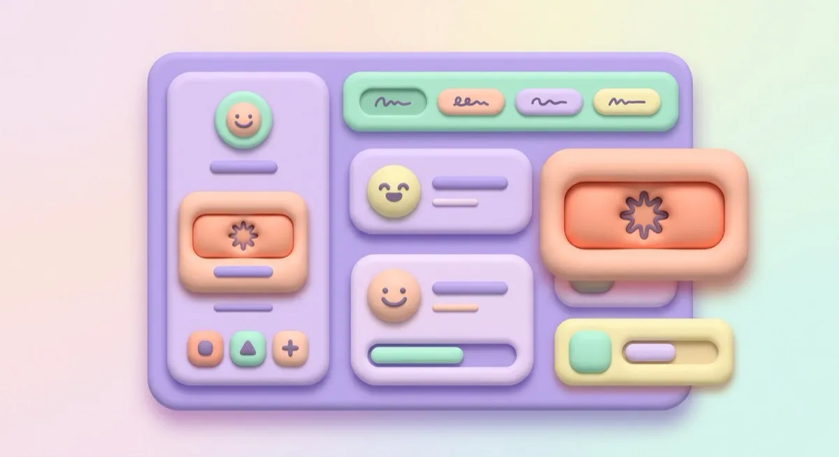
#dfd2fb#ff8f70#9fe8c0#efe7ff#35275eEverything looks squeezed from soft clay or inflated like a pool toy – rounded enough to press, coloured like sherbet. Claymorphism sits in the same shadow-faking family as skeuomorphism and neumorphism, but it’s technically distinct from both: it references no real material (unlike leather-and-felt skeuomorphism), and it fakes inflated, rounded volume in vivid pastel rather than neumorphism’s flat monochrome extrusion.
One honesty note about the stage: the peach button against the lavender ground is a waived pair in this site’s contrast gate – clay separates elements by inflated volume (the three-shadow stack), not by outline, and that’s the style working as designed. The button’s own label passes at full text contrast.
A 2020s evolution named for its literal metaphor: elements meant to look physically sculpted from soft material. The 2026 adoption data is precise and worth keeping precise: still a small share but growing fast – roughly doubling from 0.03% to 0.08% of 208,000-plus generations between January and May – and concentrated specifically in kids’ products, edtech and illustration-heavy landing pages. A genuinely narrow niche, not a broad trend. (Single-source figures, as flagged throughout this catalogue.)
Kids’ products, education, wellness and habit apps, onboarding flows that need to feel unintimidating, gamified experiences generally. The tactile-friendliness read is a real asset exactly there – Duolingo’s chunky pressable everything is the mainstream proof.
Enterprise software, serious fintech, developer tooling, dense analytics. The softness that reads as “friendly” in a kids’ app reads as “not serious” where professional authority is the job – a direct trade-off, not a universal positive.
Neumorphism – two shadows, monochrome, flat-extruded, stuck to its surface; clay is three shadows, pastel, inflated and floating. Skeuomorphism – points at real materials; clay is an abstract softness. Side by side in this family’s cards you can watch four depth illusions built from the same few CSS primitives – shadow, inset, gradient, blur – composed four different ways.
The actual scope from style-scopes.css – the CSS that painted the stage above.
/* ===== style: claymorphism ===== */
/* Inflated, not extruded: 20-40px radii, two inset shadows plus one
   tinted outer drop, vivid pastel, chunky pressable shapes. */
[data-style='claymorphism'] {
  --bg-page: #efe7ff;
  --bg-raised: #dfd2fb;
  --bg-active: #cfbef7;
  --border-default: #71619e;
  --border-hover: #5c4d87;
  --border-input: #71619e;
  --text-primary: #35275e;
  --text-secondary: #55467e;
  /* @contrast-waiver: accent-solid/bg-page – pastel peach on pale
     lavender; clay separates by inflated volume (the three-shadow
     stack), not by outline. Taught in the entry's tells. */
  --accent-solid: #ff8f70;
  --accent-solid-hover: #ffa78e;
  --accent-text: #6335bd;
  --on-accent: #481505;
  --radius-s: 20px;
  --radius-m: 28px;
  --radius-l: 36px;
  --shadow-1:
    inset 5px 5px 10px rgba(255, 255, 255, 0.65),
    inset -5px -5px 10px rgba(84, 58, 138, 0.28),
    10px 16px 28px rgba(84, 58, 138, 0.35);
  --shadow-2:
    inset 5px 5px 10px rgba(255, 255, 255, 0.65),
    inset -5px -5px 10px rgba(84, 58, 138, 0.28),
    14px 22px 36px rgba(84, 58, 138, 0.42);
  --font-sans: 'Baloo 2 Variable', system-ui, sans-serif;
}
.sty-card[data-style='claymorphism'],
[data-style='claymorphism'] .sty-panel {
  border-color: transparent;
}
[data-style='claymorphism'] .sty-btn {
  border-color: transparent;
  box-shadow:
    inset 3px 3px 6px rgba(255, 255, 255, 0.5),
    inset -3px -3px 6px rgba(120, 42, 20, 0.25),
    6px 10px 18px rgba(84, 58, 138, 0.3);
}
.sty-card[data-style='claymorphism']:hover {
  transform: translateY(2px) scale(0.995); /* pressed clay squashes, slightly */
}
/* Vignette: puffy pastel volumes, tinted shadows echoing each hue. */
[data-style='claymorphism'] .sty-art {
  border: none;
  background: #e6dbff;
}
[data-style='claymorphism'] .sty-art > i {
  border-radius: 999px;
  opacity: 1;
}
[data-style='claymorphism'] .sty-art .sty-art-a {
  inset: 16px auto auto 16px;
  width: 52px;
  height: 52px;
  background: #ff8f70;
  box-shadow:
    inset 4px 4px 8px rgba(255, 255, 255, 0.55),
    inset -4px -4px 8px rgba(150, 60, 30, 0.3),
    8px 12px 20px rgba(150, 60, 30, 0.3);
}
[data-style='claymorphism'] .sty-art .sty-art-b {
  inset: 30px auto auto 88px;
  width: 34px;
  height: 34px;
  background: #9fe8c0;
  box-shadow:
    inset 3px 3px 6px rgba(255, 255, 255, 0.6),
    inset -3px -3px 6px rgba(40, 120, 80, 0.3),
    6px 10px 16px rgba(40, 120, 80, 0.3);
}
[data-style='claymorphism'] .sty-art .sty-art-c {
  inset: auto auto 14px 16px;
  width: 64px;
  height: 26px;
  background: #b9a4ef;
  box-shadow:
    inset 3px 3px 6px rgba(255, 255, 255, 0.6),
    inset -3px -3px 6px rgba(84, 58, 138, 0.35),
    6px 10px 16px rgba(84, 58, 138, 0.35);
}
/* ===== end claymorphism ===== */Meant to be copied, not paraphrased – anchors beat adjectives when briefing an agent.
Named links out – the vignettes above are reconstructions, never screenshots (ADR #006).