Neumorphism
One CSS technique – two opposing soft shadows on an element the same colour as its background – and a settled accessibility verdict against it.
Read the entryAlso called: New skeuomorphism
One CSS technique – two opposing soft shadows on an element the same colour as its background – and a settled accessibility verdict against it.
Lineage: Coined around 2019-2020 as "new skeuomorphism"; designer adoption collapsed by 2021.
Neumorphism
One CSS technique – two opposing soft shadows on an element the same colour as its background – and a settled accessibility verdict against it.
Read the entryA working sample – the controls are live (hover, press, focus, the toggle's two states) and everything inside the frame is painted by the token block shown in the recipe below. Nothing saves anything; "Advanced options" jumps to the recipe. The page around the frame stays in Atlas's own system.
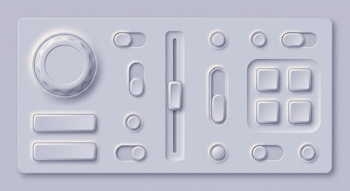
#e0e5ec#d6dce5#b8bfca#ffffff#2f353dTake skeuomorphism, remove the materials, keep only the extrusion: elements the exact colour of their background, made visible purely by a light shadow on one side and a dark one on the other. That’s neumorphism, and it photographs beautifully – which is exactly how it fooled a lot of designers in 2020.
The stage above ships the style’s flaw honestly. Four of its colour pairs are formally waived from this site’s own contrast gate (they print as WAIVED on every run): the card border, the input border and the button are all the same colour as their background, because that is the style. The text still passes – the page never sacrifices its own readability to make the point.
Coined around 2019-2020 as “new skeuomorphism”, it spread through Dribbble-era concept shots far faster than through shipped products. The honest 2026 verdict, quoted from the source directly: “As a full design system, essentially yes: designer adoption collapsed by 2021 over accessibility.” The named causes are structural WCAG failures, invisible state changes – a disabled and an enabled button can look nearly identical, because colour never changes, only shadow direction – and collapsed visual hierarchy. CRED, the style’s most famous adopter, shipped a non-neumorphic redesign in 2022. By 2026 the generation data has neumorphism prompts declining from 0.69% to 0.41% of 208,000-plus generations between January and May – roughly a twentieth of glassmorphism’s share over the same period. (Single-source figures from one company’s generation logs; the direction is more trustworthy than the exact percentages.)
An isolated toggle, dial or hardware-simulating control inside a flat system. The extrude-and-press metaphor genuinely maps to a physical switch, and at that scale the accessibility exposure is containable.
As a system-wide treatment, full stop. Unlike most entries in this catalogue, the case here is settled, not contested. The prompt vocabulary’s final phrase – “monochrome – used only for this one control, not the whole interface” – carries the load-bearing scoping clause: an unscoped neumorphism prompt will over-apply it.
Skeuomorphism – references real materials with a full light model; neumorphism is the monochrome abstraction. Claymorphism – looks soft too, but fakes inflated volume with a three-shadow stack, vivid pastels and real separation from the page; neumorphism is flat-extruded, monochrome, and stuck to its surface by definition.
The actual scope from style-scopes.css – the CSS that painted the stage above.
/* ===== style: neumorphism ===== */
/* The whole effect is one technique: two soft shadows, light and dark,
   on an element the same colour as its background. Monochrome by
   definition – which is exactly its settled accessibility problem. */
[data-style='neumorphism'] {
  --bg-page: #e0e5ec;
  --bg-raised: #e0e5ec;
  --bg-active: #d6dce5;
  /* @contrast-waiver: border-default/bg-page – same-colour extrude is the
     style's defining move and its documented flaw; boundaries are carried
     by the dual shadows. Taught under "when it's wrong" in the entry. */
  /* @contrast-waiver: border-default/bg-raised – as above; the entry's
     prose owns this failure, the page's reading surfaces do not. */
  --border-default: #d3dae3;
  --border-hover: #c8d0db;
  /* @contrast-waiver: border-input/bg-raised – inputs read as pressed
     insets (the flipped-shadow variant), not outlined fields; taught in
     the entry alongside the invisible-state critique. */
  --border-input: #c3ccd8;
  --text-primary: #2f353d;
  --text-secondary: #4d5661;
  /* @contrast-waiver: accent-solid/bg-page – the extruded button IS the
     background colour; that is the entry's core cautionary lesson. Its
     label still passes as a text pair. */
  --accent-solid: #e0e5ec;
  --accent-solid-hover: #e8edf4;
  --accent-text: #3d4db7;
  --on-accent: #2f353d;
  --radius-s: 12px;
  --radius-m: 16px;
  --radius-l: 20px;
  --shadow-1: 9px 9px 18px #b8bfca, -9px -9px 18px #ffffff;
  --shadow-2: 11px 11px 22px #b0b8c4, -11px -11px 22px #ffffff;
  --font-sans: system-ui, -apple-system, 'Helvetica Neue', sans-serif;
}
.sty-card[data-style='neumorphism'],
[data-style='neumorphism'] .sty-panel,
[data-style='neumorphism'] .sty-btn,
[data-style='neumorphism'] .sty-btn-2 {
  border-color: transparent;
}
[data-style='neumorphism'] .sty-btn {
  box-shadow: 5px 5px 10px #b8bfca, -5px -5px 10px #ffffff;
}
[data-style='neumorphism'] .sty-input {
  box-shadow: inset 4px 4px 8px #b8bfca, inset -4px -4px 8px #ffffff;
  border-color: transparent;
  background: #e0e5ec;
}
/* Vignette: the one technique, both directions – extruded pills beside a
   pressed inset, all the exact colour of their ground. */
[data-style='neumorphism'] .sty-art {
  border: none;
}
[data-style='neumorphism'] .sty-art > i {
  background: #e0e5ec;
  border-radius: 14px;
  opacity: 1;
}
[data-style='neumorphism'] .sty-art .sty-art-a {
  box-shadow: 5px 5px 10px #b8bfca, -5px -5px 10px #ffffff;
}
[data-style='neumorphism'] .sty-art .sty-art-b {
  box-shadow: inset 4px 4px 8px #b8bfca, inset -4px -4px 8px #ffffff;
}
[data-style='neumorphism'] .sty-art .sty-art-c {
  box-shadow: 5px 5px 10px #b8bfca, -5px -5px 10px #ffffff;
  border-radius: 999px;
}
/* Hover: the extrusion deepens (base shadow-2 duals) and lifts a hair. */
.sty-card[data-style='neumorphism']:hover {
  transform: translateY(-1px);
  border-color: transparent;
}
/* ===== end neumorphism ===== */Meant to be copied, not paraphrased – anchors beat adjectives when briefing an agent.
Named links out – the vignettes above are reconstructions, never screenshots (ADR #006).