Glassmorphism
Frosted translucency with exact numbers – 12px blur, 160% saturation, a 1px light border – floating over grounds that stay blurrily visible.
Read the entryFrosted translucency with exact numbers – 12px blur, 160% saturation, a 1px light border – floating over grounds that stay blurrily visible.
Lineage: Prominent since ~2020 (macOS Big Sur, Windows 11 Fluent); the direct ancestor of Apple's Liquid Glass.
Glassmorphism
Frosted translucency with exact numbers – 12px blur, 160% saturation, a 1px light border – floating over grounds that stay blurrily visible.
Read the entryA working sample – the controls are live (hover, press, focus, the toggle's two states) and everything inside the frame is painted by the token block shown in the recipe below. Nothing saves anything; "Advanced options" jumps to the recipe. The page around the frame stays in Atlas's own system.
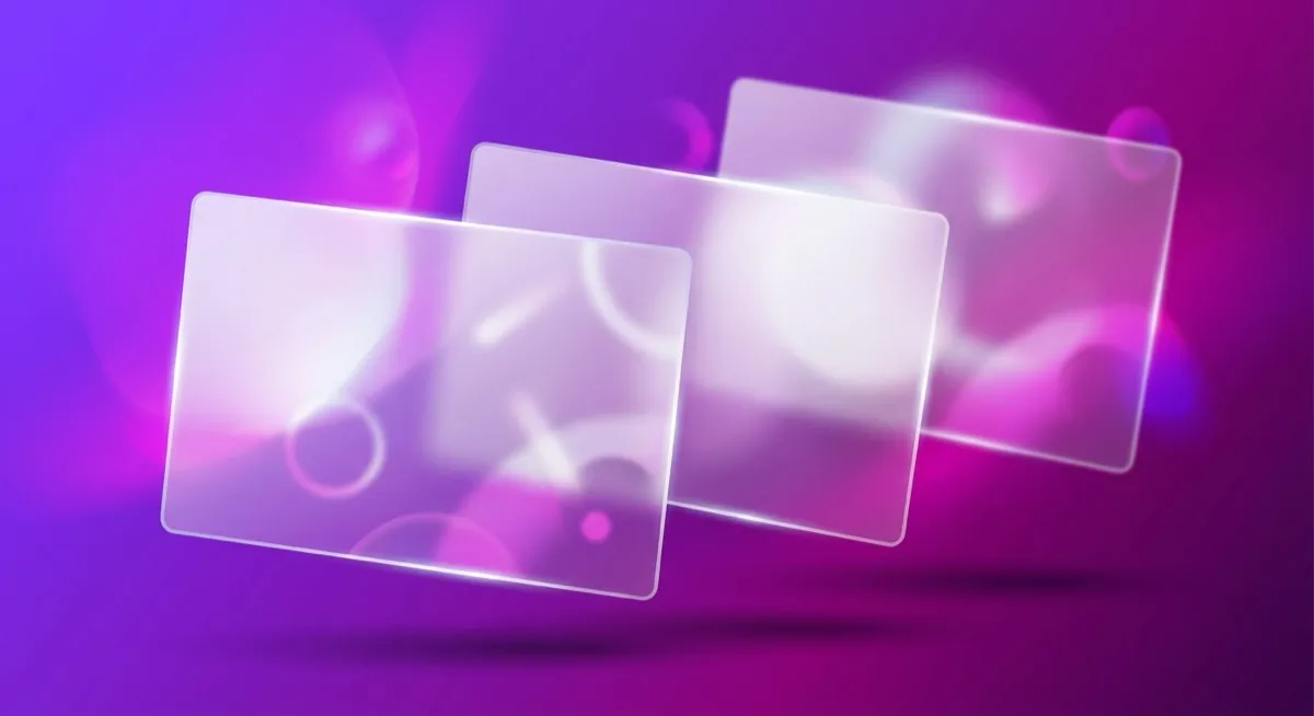
Frost a pane of glass and hold it over a colourful page: you can’t read what’s behind it, but you know something is there – depth without detail. Glassmorphism does that with two CSS properties and some discipline about the numbers, and it’s the rare trend that is still growing: requests climbed from 7.45% to 9.89% of 208,000-plus generations between January and May 2026. (Single-source figures; trust the direction over the decimals.)
Look closely at where the glass actually is in the stage above: the vignette chip, floating over the vivid gradient – never under the card’s body text. That’s Nielsen Norman Group’s own guidance being demonstrated rather than dodged, and the chip’s ink-over-blur contrast is checked by this site’s gate against the gradient’s darkest stop.
Prominent in Apple and Microsoft systems since around 2020 – macOS Big Sur, then Windows 11’s Fluent Design – and the direct conceptual ancestor of Apple’s 2025-26 Liquid Glass, whose full contested story (the WWDC walkback, the transparency slider) note 09 treats as a live case study. The style’s whole 2020s arc is the decorative pendulum swinging back after a decade of flat.
Sparingly, for depth and hierarchy cues – a layer that says “this floats above that” without a heavy shadow. NN/g’s recommendations are unusually concrete: keep WCAG contrast compliance regardless of the translucent treatment, use more blur over complex backgrounds rather than less, and lean on the platform implementations (SwiftUI, Fluent) rather than hand-rolling glass.
Body text sitting directly on glass over a complex or bright background – readability degrades exactly where the effect looks most impressive. And anywhere you can’t ship the fallback: reduced-transparency settings and unsupported browsers must get the 0.85-opacity solid, or the design fails quietly for the people least able to work around it.
Skeuomorphism – Liquid Glass shows the overlap: the same “realism via light physics” instinct, applied to one abstract material instead of leather and felt. Neumorphism – also soft, but opaque, monochrome and extruded from its surface; glass is translucent and floats above.
The actual scope from style-scopes.css – the CSS that painted the stage above.
/* ===== style: glassmorphism ===== */
/* Frosted panels over a vivid ground. --bg-raised pins the SOLID
   fallback (what non-supporting browsers render); the blur is a
   @supports upgrade confined to surfaces that carry no body text. */
[data-style='glassmorphism'] {
  --bg-page: #eeeaf7;
  --bg-raised: #f7f4fc;
  --bg-active: #e2dcf2;
  --border-default: #837d9a;
  --border-hover: #6a6485;
  --border-input: #837d9a;
  --text-primary: #221a44;
  --text-secondary: #4c4468;
  --accent-solid: #5f3dc4;
  --accent-solid-hover: #4c2f9e;
  --accent-text: #5636b4;
  --on-accent: #ffffff;
  --radius-s: 10px;
  --radius-m: 16px;
  --radius-l: 20px;
  --shadow-1: 0 8px 32px rgba(34, 26, 68, 0.18);
  --shadow-2: 0 12px 40px rgba(34, 26, 68, 0.24);
  --font-sans: system-ui, -apple-system, 'Helvetica Neue', sans-serif;
  /* Gate-checked composite: for white ink over 0.12 glass, the WORST
     ground is the gradient's LIGHTEST stop (review M4) – pinned here so
     the chip stays AA wherever it sits over the vignette. All three
     stops keep the white-ink composite >= 4.5:1 by construction. */
  --sty-glass-bg: rgba(255, 255, 255, 0.12);
  --sty-glass-bg-hover: rgba(255, 255, 255, 0.15); /* gate-checked too (v1.1 M2) */
  --sty-glass-under: #6247c4;
  --sty-glass-ink: #ffffff;
}
[data-style='glassmorphism'] .sty-art {
  background-image: linear-gradient(135deg, #6247c4 0%, #46329e 55%, #a03080 100%);
  border: none;
}
[data-style='glassmorphism'] .sty-art .sty-art-a,
[data-style='glassmorphism'] .sty-art .sty-art-b {
  background: #ffffff;
  opacity: 0.9;
}
[data-style='glassmorphism'] .sty-art .sty-art-a {
  width: 38%;
}
[data-style='glassmorphism'] .sty-art .sty-art-b {
  width: 30%;
}
/* The glass chip – fallback first (the note's own 0.85 solid), blur as a
   @supports upgrade. Hand-computed per CONVENTIONS: fallback ink #221a44
   on 0.85 white over the lightest stop #6247c4 composites to 12.9:1
   (darker stops only improve it); the supported state (white ink over
   0.12 glass on the lightest stop) is gate-checked via --sty-glass-*,
   printing 5.02:1. Both states identical in both site themes. */
[data-style='glassmorphism'] .sty-art::after {
  content: 'Aa';
  position: absolute;
  inset: 14px 14px auto auto;
  display: grid;
  place-items: center;
  width: 74px;
  height: 62px;
  background: rgba(255, 255, 255, 0.85);
  color: #221a44;
  border: 1px solid rgba(255, 255, 255, 0.25);
  border-radius: 16px;
  font-size: var(--text-lg);
  font-weight: 600;
}
@supports ((backdrop-filter: blur(1px)) or (-webkit-backdrop-filter: blur(1px))) {
  [data-style='glassmorphism'] .sty-art::after {
    background: var(--sty-glass-bg);
    -webkit-backdrop-filter: blur(12px) saturate(160%);
    backdrop-filter: blur(12px) saturate(160%);
    color: var(--sty-glass-ink);
    box-shadow: 0 8px 32px rgba(34, 26, 68, 0.28);
  }
}
@media (prefers-reduced-transparency: reduce) {
  [data-style='glassmorphism'] .sty-art::after {
    background: rgba(255, 255, 255, 0.85);
    -webkit-backdrop-filter: none;
    backdrop-filter: none;
    color: #221a44;
  }
}
/* Hover: the glass clears a step – by moving the gate-checked property,
   so the @supports and reduced-transparency branches stay untouched. */
.sty-card[data-style='glassmorphism']:hover {
  --sty-glass-bg: var(--sty-glass-bg-hover);
}
/* ===== end glassmorphism ===== */Meant to be copied, not paraphrased – anchors beat adjectives when briefing an agent.
Named links out – the vignettes above are reconstructions, never screenshots (ADR #006).